In order to optimize the number of people that subscribe to your notifications, you need to use the right user interface (UI). It's also important to design a good user experience (UX), so that the notification prompt is perceived as something useful for the user and not as an annoyance. In this post we'll analyze different approaches and user interfaces that are useful to ask users to subscribe to web push notifications.
Browser permission prompt (native prompt) on page load
One of the most common strategies is to ask users to subscribe to notifications as soon as they enter a website. Basically, if you adopt this strategy, you display the browser permission prompt (native prompt) as soon as the page is loaded.
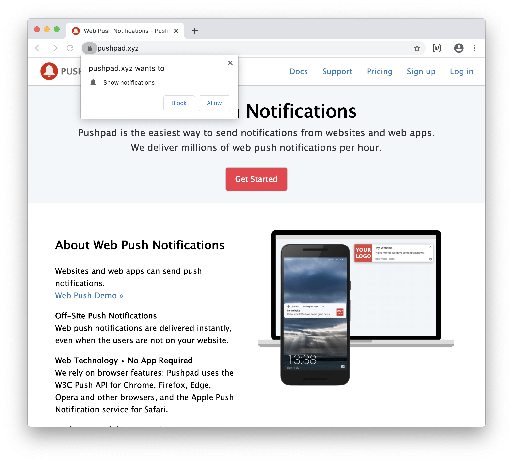
This approach is used by some large websites like Facebook and Youtube, but also by many small websites and blogs.
This strategy is somewhat similar to apps that ask to enable some permissions as soon as you open them for the first time.
If the user already knows the website / web app because he has already used it in the past or it is a famous website, then this strategy can be simple and acceptable. However this strategy is not very good if the user has just landed on a website (e.g. from a Google search) and doesn't know anything about the website.
This strategy has some serious drawbacks:
- the user may not understand what kind of notifications you want to send and why he should subscribe (the text of the prompt is defined by the browser and you cannot provide additional information)
- if the user blocks the notifications, you cannot display the prompt again (the user would need to open the browser settings or click the lock icon in the address bar to change his preferences)
- some browsers, like Firefox and Safari, block the notification prompt if you try to display it on page load (you should trigger the prompt after a user gesture, like a click).
However this strategy is simple to implement and the user can subscribe effortlessly, with a single click on "Allow". This means that, compared to other strategies that require an explicit action of the users, this strategy can produce higher subscription rates.
You can also consider to display the prompt on page load, but after a meaningful action, so that it's more likely that the user will accept to receive the notifications. For example you can display the prompt after a sign up or sign in, after a purchase, after a user has posted something, etc.
Custom prompt
A custom prompt (double opt-in) is similar to the browser permission prompt, but it is designed with HTML and CSS and can contain custom text.
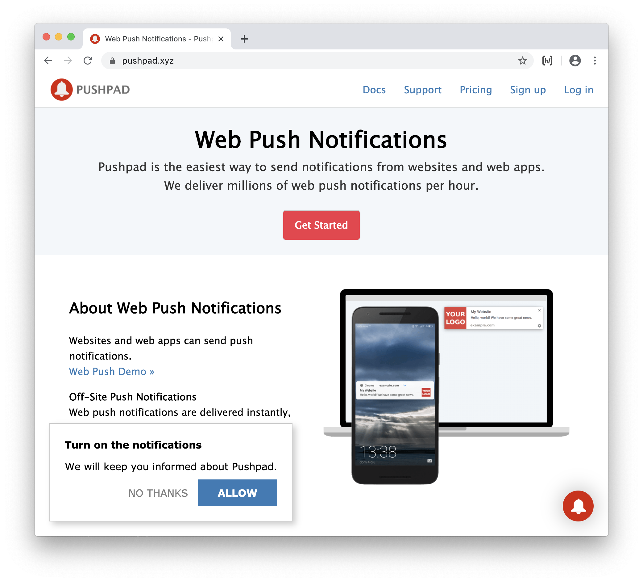
Basically, if you adopt this strategy, you have two consecutive prompts: the user needs to click "Allow" on the first prompt, built with HTML and CSS, and then click "Allow" again on the real permission prompt.
This strategy, compared to the native prompt alone, has some advantages:
- you can give more information to the user about what kind of notifications you want to send
- if the user clicks "No, thanks" on the first prompt, you can display the prompt again after some time (while the native prompt can be displayed only once)
- the prompt works on all browsers, since the native permission prompt is triggered after a user gesture (click on the custom prompt) and not on page load.
However this strategy has also some disadvantages: for example the users need two clicks to subscribe (instead of one) and you don't have the native look of the permission prompt.
Floating action button (bell)
Many websites that use a custom prompt, also display a floating action button (bell) that allows to change the notification preferences.

The bell icon, inside a circle, is often displayed on the bottom left or bottom right of the page (fixed position).
In this way, even if a user says no to the custom prompt, he can always enable the notifications using the floating button.
This solution is used by many blogs and news websites.
A disadvantage of this solution is that it can be annoying for the users to have a floating button displayed all the time just for notifications. Sometimes you may also want to use that space for other widgets, like a support chat.
Toast message
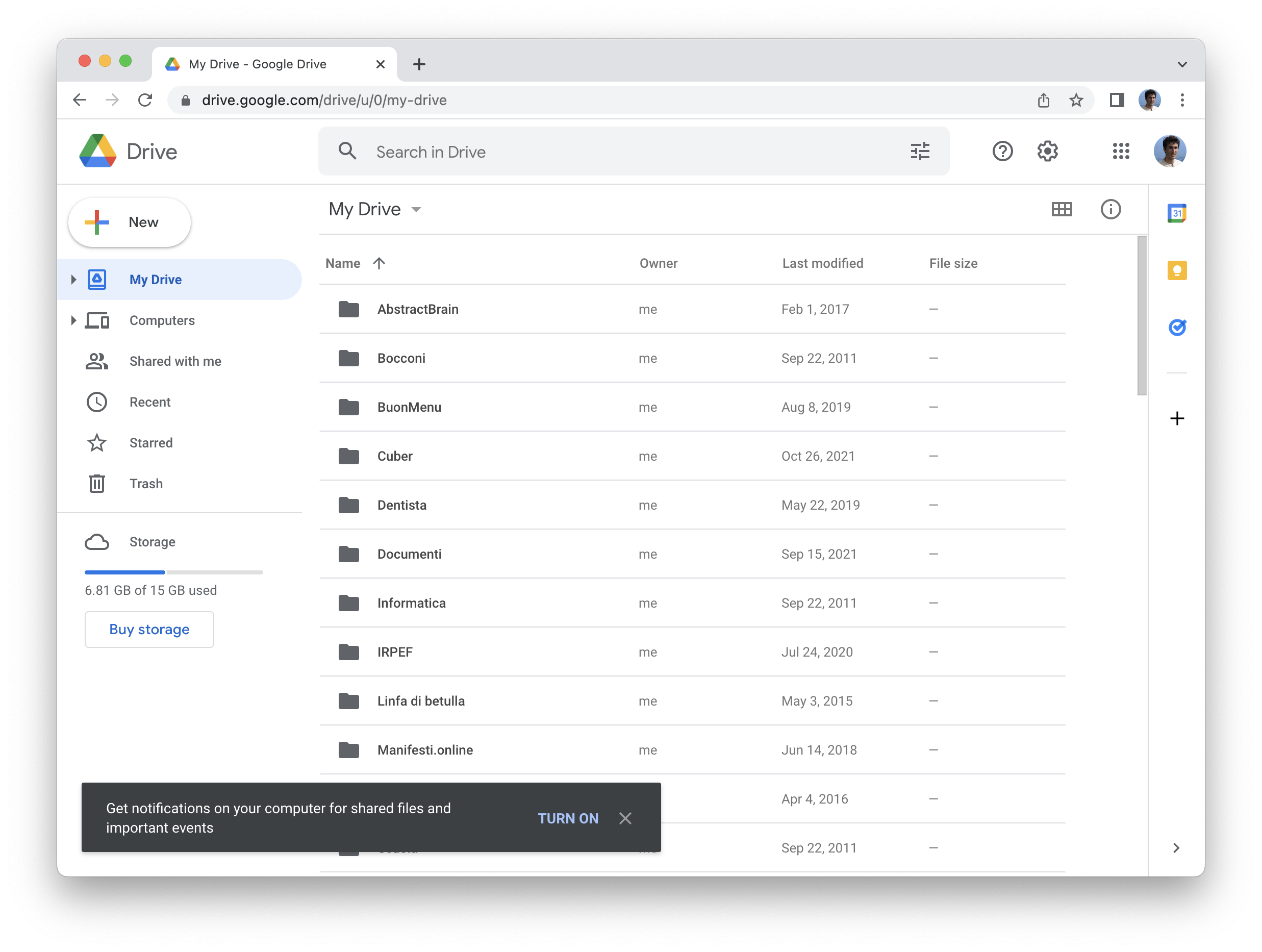
A toast message is a small message displayed at the bottom of the page. You can use that message to ask the user to enable the desktop notifications. For example:
"Please enable the push notifications to receive the messages. [Turn on] [×]"
It is very similar to a custom prompt, but is less intrusive. It is perfect for web apps, like chat or email. For example this strategy is used by Gmail / Google Workspaces on new accounts.
Display a message integrated with the UI
All the above strategies display an element (e.g. prompt, bell, toast) over the rest of the UI and the request to subscribe to the notifications is not part of the design, it's something separate.
A better alternative would be to integrate the subscribe button with the rest of the UI, thus making it more natural and appealing.
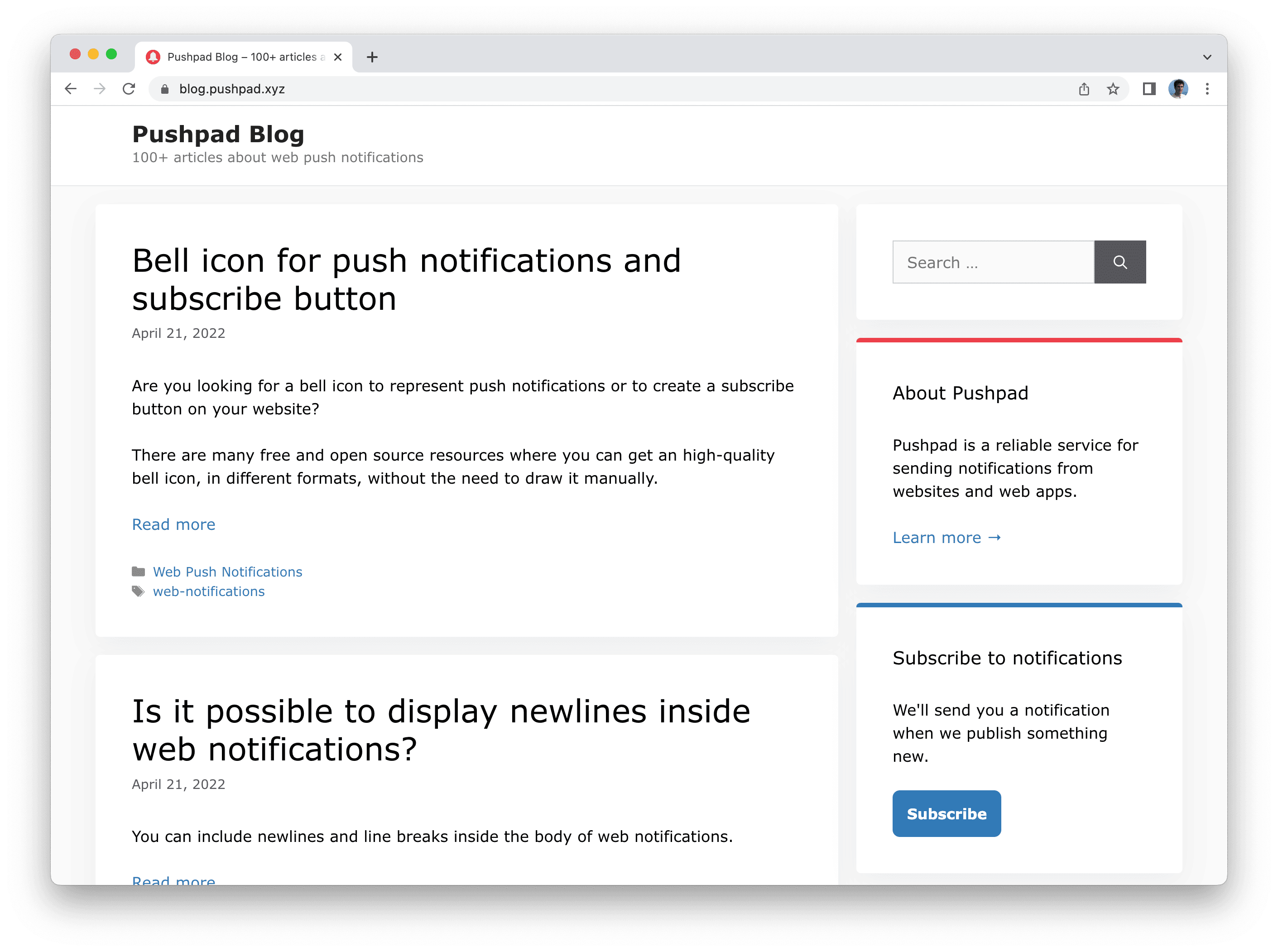
A blog, for example, instead of using a prompt, can display a message and the subscribe button in the sidebar or below the post (like you would normally do for a newsletter).
A chat application, for example, can display a request to enable the notifications near the messages, inside the inbox, to make it clear that they want to display notifications about the incoming messages.
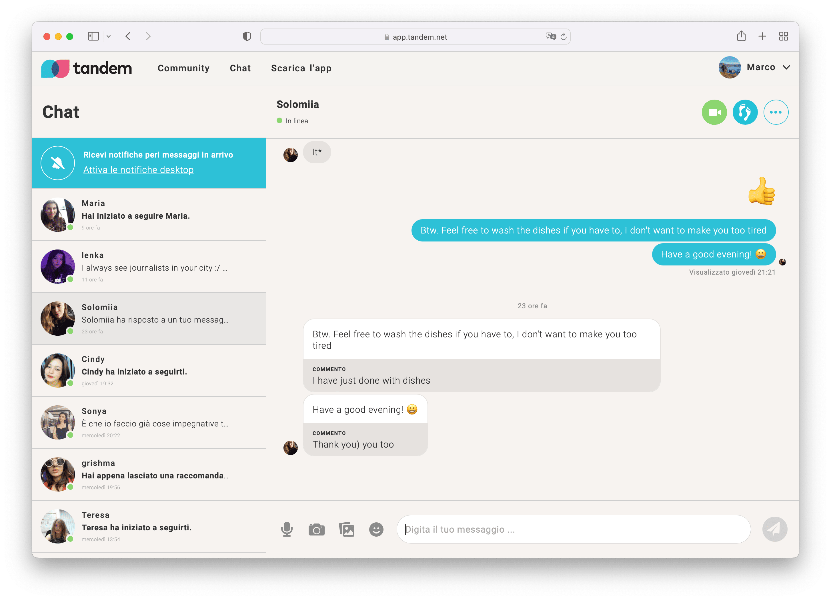
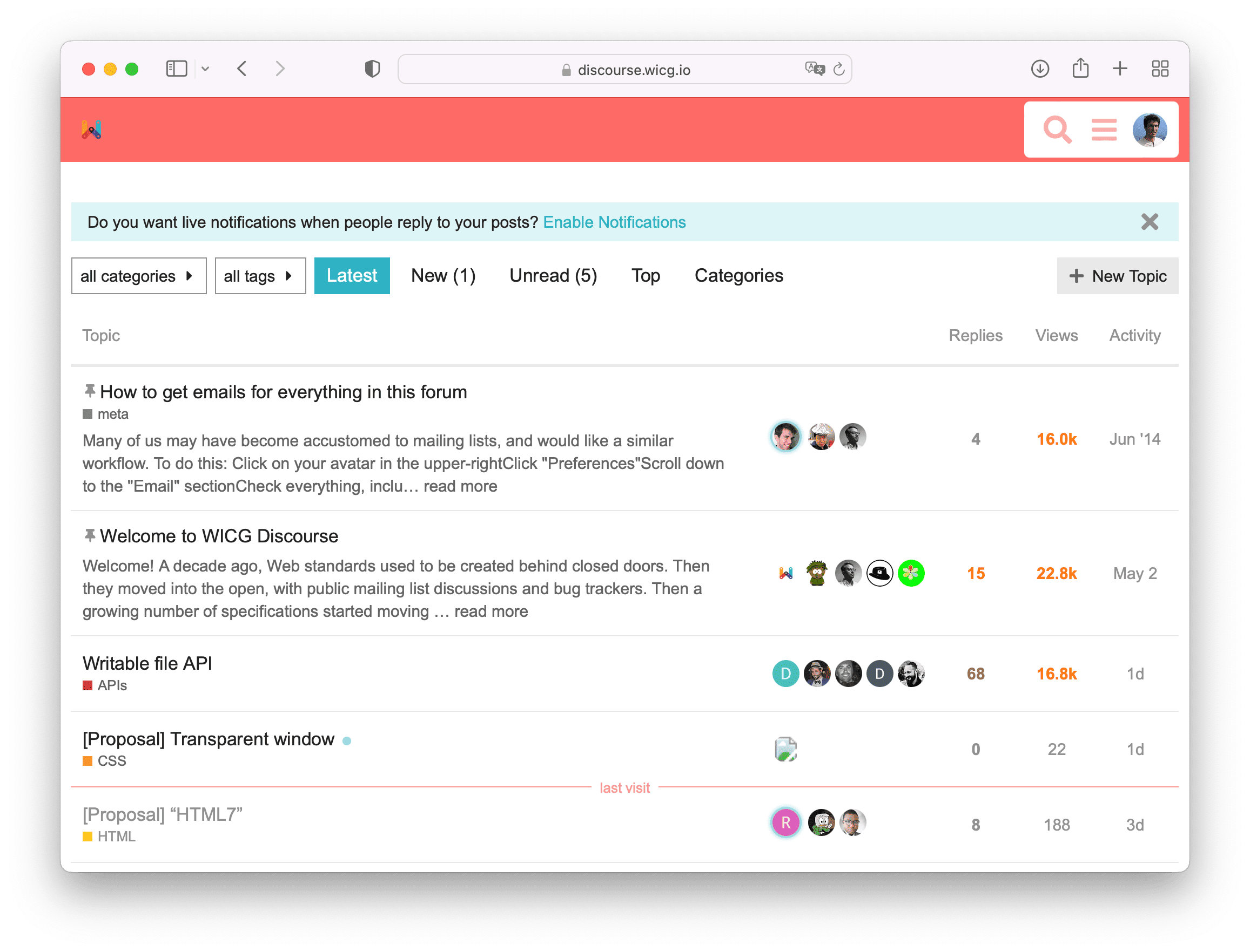
A forum can ask users to enable the notifications in order to receive relevant posts and replies. Discourse, for example, displays a simple message (also called flash message, notice or alert) above the posts and encourages the users to enable the notifications:
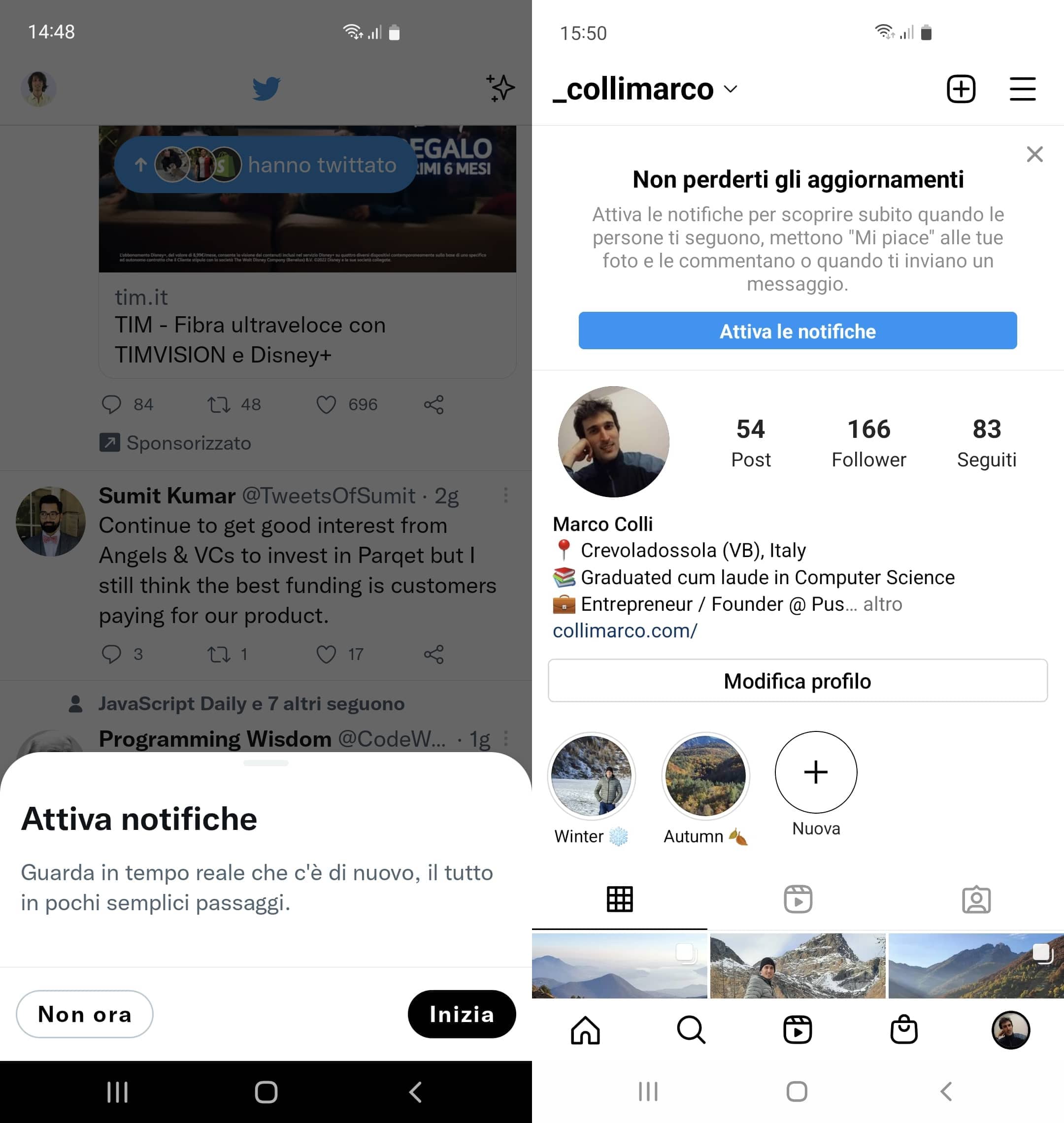
On mobile it's also possible to integrate the prompt inside the main UI, without using a prompt. For example, while Twitter uses a prompt (modal), Instagram displays a message inside the main UI.
Display a large modal
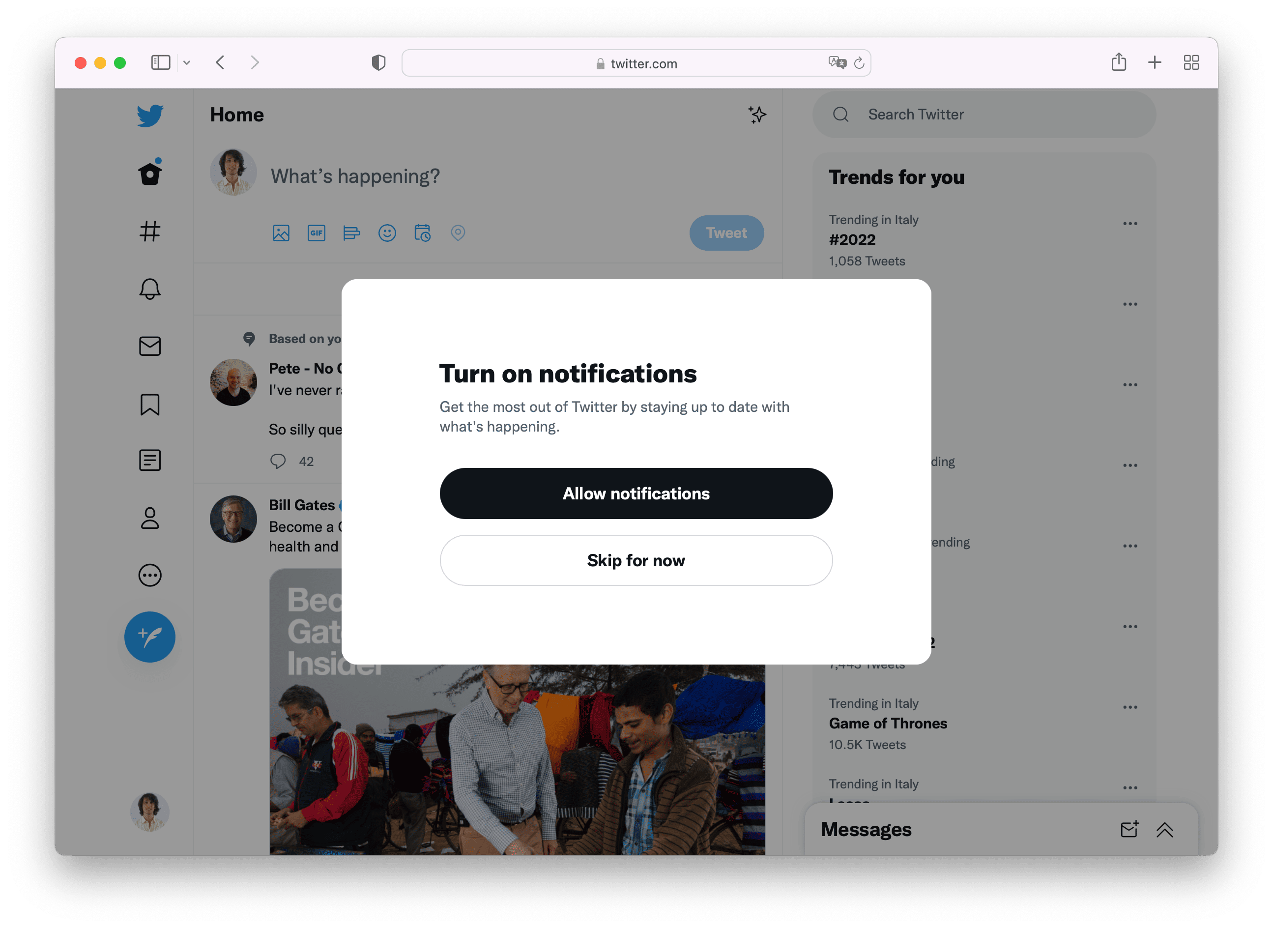
Another strategy used by some websites and web apps is to display a modal.
The use of modals is already widespread for subscribing users to the newsletter, but it can also be used to ask users to enable the notifications.
Twitter for example displays a modal for enabling the notifications after some interaction with the website:
Integration with the notification center
Many websites and web apps already have a notification center: for example they may have a bell icon in the top navigation (header) that allows users to read all the website notifications.
You can use that part of the UI to ask users to enable the desktop notifications / push notifications. Basically if a user has not yet allowed push notifications, he only receives the notifications inside the notification center of the website. When he also grants permission for push notifications, then he will receive the notifications on his device even when the website is closed.
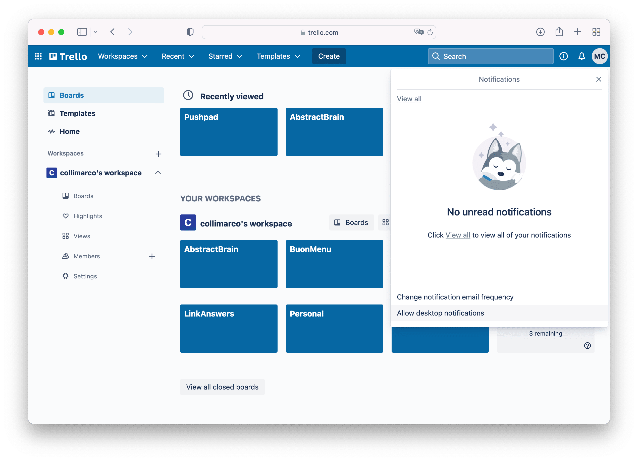
Trello, for example, offers a perfect user experience and you can enable the push notifications easily from the notification center.
Settings page
Many web applications have a "settings" section.
In particular there is often a page that allows to choose the type of emails and notifications that you want to receive. That page is perfect to include a link / button / checkbox or toggle that allows the user to turn on or off the push notifications.
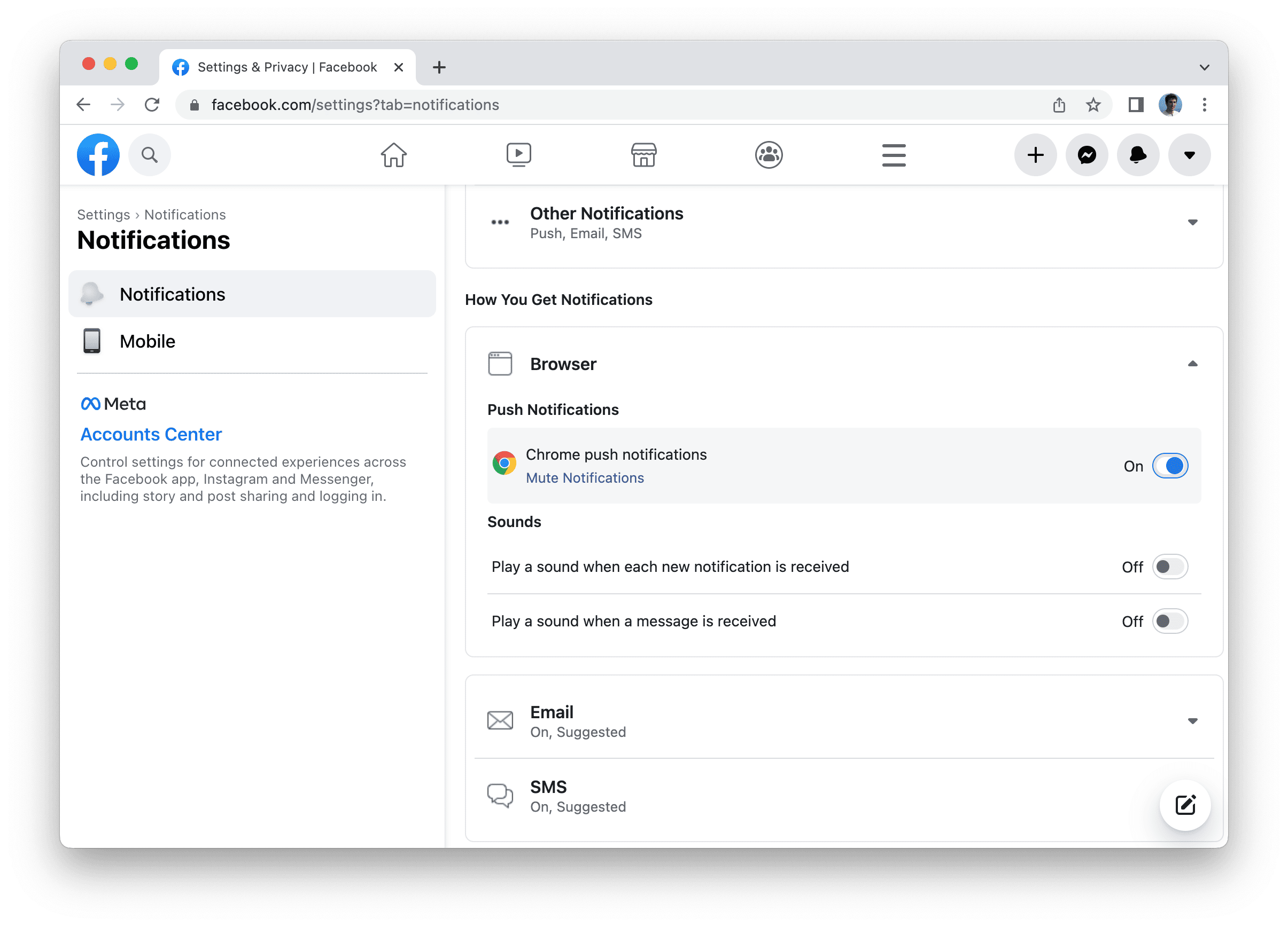
Gmail and Facebook, for example, have a settings page that allows users to turn on the desktop notifications (and on the same page you can also choose what kind of notifications you want to receive).
Subscribe button or bell icon for a specific topic
Instead of asking users to enable the notifications for the website in general, it can be interesting to ask to enable the notifications for a specific topic. This can be more interesting for a user and can produce more subscriptions to the notifications.
For example, a website like YouTube, recommends to subscribe to notifications after you have watched a video.
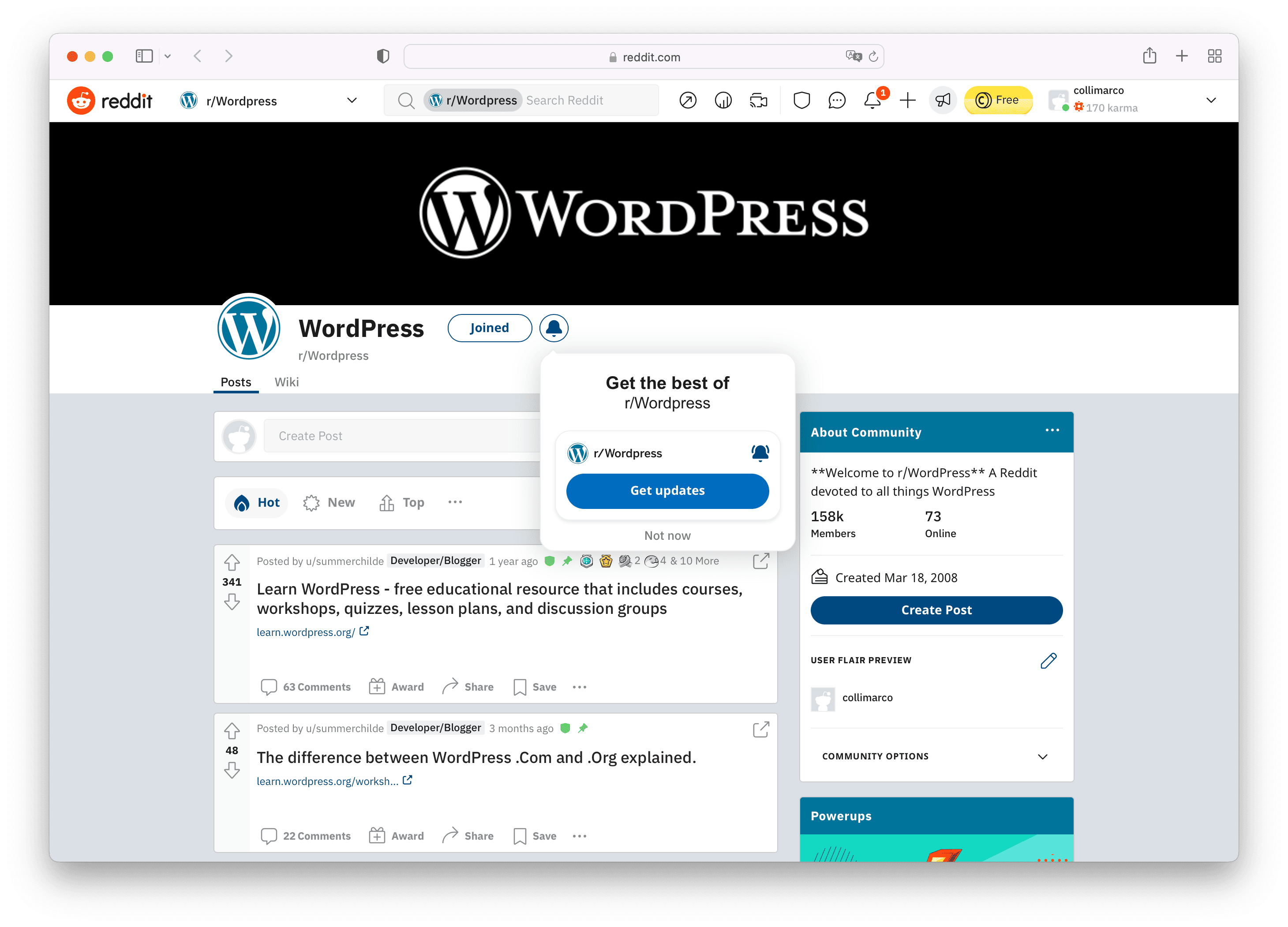
A forum or a discussion website, like Reddit, asks to enable the notifications about a specific topic after you create a post.
This makes it clear that notifications can be relevant and interesting for you, since you have just interacted with that topic.
Conclusion
While a simple prompt for push notifications is common practice, there are many other alternatives that offer a better UX and better integration with the UI.
In order to get more subscribers you need to trigger the permission prompt at the right time. For example instead of displaying the prompt immediately, you can display the permission prompt after some time, or when the user performs an action (e.g. after login, post, checkout, search, etc.) or when the user explicitly clicks a bell icon or subscribe button to enable the notifications.
You can also use different UI components and different parts of the layout to get the user attention.
You can use any element to trigger the permission prompt: a bell icon, a simple link (e.g. "Turn on the notifications"), a prompt, a modal, a toast, a button, a checkbox, a toggle or anything else.
Finally it's up to you whether you want to use a more direct strategy (e.g. prompt) or integrate the subscribe button with the UI.
Build any UI for web push notifications using the Pushpad JavaScript SDK
Pushpad offers a solution for web push notifications which makes it simple to implement any of the above strategies. You can also move easily from a strategy to another and compare the results.
If you want a drop-in solution you can simply call pushpad('widget').
Otherwise you can build any UI component with your custom style using a few simple methods: you can subscribe the user and display the native permission prompt with pushpad('subscribe'), you can get the current subscription status with pushpad('status'), you can unsubscribe the user with pushpad('unsubscribe'), you can authenticate your users with pushpad('uid') or attach other data for targeting with pushpad('tags').
These methods can be bound to any event and any element of the UI, so that the UI / UX designers have the maximum freedom.